 |
|
|
News
About Us
Membership
Events
Links
|
|
Funeralia In Excelsis: the ephemera of Britain in mourning
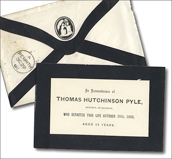
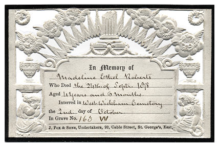
Amoret Tanner, writer and collector, is a Founding Council member of the Ephemera Society. Here she examines the ephemera of Britain in mourning. Most collectors accumulate, almost by chance, examples of the late nineteenth and early twentieth century black-edged card supplied by the local undertaker from stock. The cards enabled relatives to announce their bereavement to family and friends and they survive in their dull thousands. With little artistic or historical merit, they give no indication of the wealth of ephemera associated with death and mourning. It is a twentieth century convention that has made the topic of death one of the last of the taboo subjects, and a brief look at past customs is necessary to appreciate the large quantity of ephemera it has generated. Mourning, it must be said, has been enjoyed for centuries, both for its symbolism and for the opportunity it has given to demonstrate the social standing of the family. To leave out a single detail, to skimp one ribbon or one ritual pair of gloves, was a lapse that marked the survivors for life. Many poor families in Britain all but pauperised themselves in trying to do the thing decently. Le Blanc, writing towards the end of the eighteenth century, put it well when he said: ‘The care the English take of all particulars of their burial, would make one believe that they find more pleasure in dying than living.’ The funeral itself was naturally the most important part of the ritual, and seventeenth and eighteenth century funeral invitations are among the rarer and most attractive of death associated items. The majority were wood engraved with a surround incorporating the traditional reminders of mortality-Father Time and his scythe, skeletons, crossed bones and hour-glasses, as well as funeral processions shown in considerable detail. Wealthier families could choose copper-engraved invitations in a suitably larger size. Then, as now, the undertaker would keep a stock of blanks: the invitation generally included the phrase You are desired to accompany the Corps of ... and personal details were filled in by hand. Seating for an important funeral was limited both in church and at the subsequent feast; the words Bring the Ticket with you usually follow. Like the eighteenth and nineteenth century undertaker's trade cards and billheads to come, these invitations provide the only contemporary pictorial evidence for the costume of mourners and mutes. Toward the end of the eighteenth century the undertaker came into his own. He was the successor to the upholder, whose main profession since the thirteenth century had been to supply everything to do with beds. The upholders began to find that the business of undertaking the provision of all the fumiture, equipment, clothes, carriages, mutes, food, drink, hangings, invitations and flowers necessary for a good funeral was so profitable that it soon became the main raison d'etre for many of the larger town firms. Earlier trade cards occasionally describe the undertaker as a funeral ‘featherman’ and plumes are incorporated into the design of the card. This refers to the custom of decorating a board on the coffin, as well as the horse furniture, with large displays of black or white feathers, the colour depending on the marital status of the deceased. The plumes continue to be clearly seen on trade cards and billheads throughout the nineteenth century. The custom itself died out only in 1917. Trade cards also give an insight into the associated skills which some undertakers could offer. The most common, as might be expected, was that of carpenter and joiner; others appeared to combine the duties of a modern bailiff by offering to collect rents, or to act as ‘general agent for the management of House and Land Property’ (this underneath a fine engraving of a large cemetery). By the nineteenth century the funeral invitation had gone out of fashion; its place was taken by small memorial cards which were sent out after the funeral had taken place. For about 25 years from the 1840s these cards reached a very high design standard, a standard unfortunately not matched by the quality of the printing added by the local jobbing printer. The majority of the cards, intricately blind embossed and pierced, were produced by firms such as Wood and Mansell who were sufficiently proud of the result to impress their name on them.
The cards are normally white with a thin black border, with classical renderings of weeping figures, urns, broken columns, willows and mourning angels. The vogue for gothic architecture is particularly finely caught. It appears as a major design feature in many of the cards as well as on the elaborate mounts backed with black flock to set off the elaborate filigree effect of their own embossing and piercing. The mounts provided a central space for display of the mourning card, the whole designed for framing. By 1900 the fashion was for a folding card with message and name printed inside. Designs were lithographed and silver and other muted colours were popular. A specimen book produced by a Batley, Yorkshire, printer for 1892 shows 35 samples, although in his accompanying letter he states that he holds an assortment of 12,000 to 15,000 patterns in stock. His samples show black-edged single cards at l/- a dozen; lithographed folding cards incorporating the now popular lilies-of-the-valley or a wreath of flowers round a cross at 2/6 per dozen; or a copper engraved design at 3/6 ‘cost of plate extra’. These prices included the matching black-edged envelopes. The public funerals of statesmen generated their own ephemera. In addition to the many souvenirs sold in the streets, the funeral of the Duke of Wellington in 1852 produced at least twelve different classes of ticket, all numbered, allocated according to status or sold to the public at large. For high-ranking colleagues and family there were engraved tickets authenticated by a seal on black sealing wax. At the other end of the scale, local inhabitants were merely provided with an undecorated pass card printed by letterpress. 
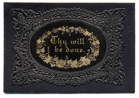
From the 1780s onwards the fashion magazines at times of national grief included the occasional plate to indicate suitable mourning wear. As the nineteenth century progressed and the rules of mourning became more demanding, it was possible for one young mistress of a reasonably wealthy Victorian establishment to complain that although she had been married for seven years, every one of her trousseau dresses remained unworn because of the rapid succession of deaths of her relations-in-law. It was demands such as these that founded the fortunes of several major London stores, among them the firm of Jay’s which opened in 1841 in Regent Street as ‘The London General Mourning Warehouse’. By 1855 there were four major mourning warehouses in the same street, with others in the vicinity. Advertising handouts, leaflets produced by the stores advising on mourning etiquette, pictorial billheads showing the splendid shop front with its suitably gothic windows and fashion catalogues are among the ephemera which survive. The design of this package label expresses the affluence of the company that led London’s mourning industry in the middle of the nineteenth century. Commenting on the shop’s modishness, Henry Mayhew observed that “our sackcloth must be of the finest quality... our grief goes for nothing if not fashionable”. The mourning warehouses announced that ‘Ladies living at a distance may be supplied at their own Residence’ but for those living beyond even this service, there were specially produced catalogues. Jay’s Catalogue for 1861 includes eight lithographed plates illustrating morning dresses, dinner dresses, mantles and suitable accessories. The final page tactfully suggests appropriate dress for the varying ‘degrees’ of bereavement, ranging through the hierarchy of family relationships. The firm’s much enlarged catalogue for Spring 1862 included two engravings of their Regent Street shop and, in a page of boxed display advertisements, used a liberal variety of typefaces to describe the merits of their stock. ‘A complete Suit of Domestic Mourning for 2½ guineas’ was appropriate for the servants. The idea of black as the only possible colour for mourning is an artificial one; black represents sorrow to us only because we have made it so. In China, for example, from time immemorial it has been white, the sign of purity and hope, and the ladies of Sparta wore the same colour. In England white, as a symbol of innocence, was commonly used as a mourning colour for dead children. The Christian Church mourns not in black but in purple, the colour of the garment the Roman soldiers threw over Christ’s shoulder when they mockingly proclaimed him ‘King of the Jews’.
There can be humour even in a collection of mourning ephemera and a favourite category of mine is that of the mock mourning cards which are considerably rarer than the conventional ones. Examples are ‘Sacred to the memory of the late Brisk Trade Esq. who shuffled off this mortal coil in Autumn 1876’ and a fine card ‘In memory of Honor, wife of John Bull, Who died in the Transvaal and was interred at Candahar March 1881’. © Amoret Tanner 2003. All Rights Reserved
|
|


 These colours are reflected in the printed silk bookmarkers given as personal
mementoes between 1880 and 1925; details of children and the unmarried
are recorded in black print on white silk; mauve silk was used for the
married. The markers were cheaply produced and generally printed locally.
One particularly poignant marker has a sepia photograph of the World War
1 soldier who died of wounds in France and was ‘Deeply mourned by
his Sweetheart’.
These colours are reflected in the printed silk bookmarkers given as personal
mementoes between 1880 and 1925; details of children and the unmarried
are recorded in black print on white silk; mauve silk was used for the
married. The markers were cheaply produced and generally printed locally.
One particularly poignant marker has a sepia photograph of the World War
1 soldier who died of wounds in France and was ‘Deeply mourned by
his Sweetheart’.|
Home | News | About Us | Membership | Events | Links | Contact | Item of the month | Articles |
| Copyright © The Ephemera Society 2025. All Rights Reserved. |